Showing posts with label papertrey ink. Show all posts

Monday, July 13, 2015

Sending Prayers and Sympathy

Hello and Happy Monday!

I'm back today, after a brief absence as unfortunately my body is an "equal opportunity employer" and thus it has "hired" a viral and bacterial infection over the past week...which has left me with laryngitis, fatigue and a bad case of 'blog-o-phobia'. Haha, all is true other than the 'blogophobia' though I think it has quite a ring to it! ;-) But I digress...

Here's a card that was created with inspiration from many different challenges/blogs! The colors were culled from this gorgeous combination from last week's (#298) Colour Q Challenge, which will be open for only a few more hours!


My use of twine, and my color scheme was also heavily influenced by this gorgeous photo provided by the Creative Color Challenge :
(From top to bottom and left to right: 
Row 1, box 5/Row 2 box 3/Row 3, boxes 6 and 7/Row 4, boxes 1 and 2)


I was then inspired by this month's Virginia's View Challenge challenge, which focuses on stamping:


I stamped the butterflies from PTI's You're A Masterpiece Make-It-Market kit on watercolor paper, using Tsukineko's Onyx black ink and by doing a ton of masking.  There is no companion die for the butterfly, so I stamped a few on post-it notes, fussy cut them and used them as masks. After each individual butterfly was stamped, I heat embossed them with clear embossing powder. Doing so gave such beautiful texture and really helped "contain" the watercolors. I was especially concerned with that because of the purple and yellow, which are complementary colors. I like to think of complementary colors as friends that get along splendidly...but then if they decide to be roommates and live together...well things get murky. hehe ;-)

I finally pulled out my new "toys", namely my Kuretake Zig Clean Color Real Brush Pens and the Akashiya Sais. I purchased the 36 pen set of Zigs and the 20 pen set of Akashiyas and have actually found that there is virtually no overlap in colors, in fact they complement one another! I am into calligraphy and brush lettering and so I purchased both to see which I liked best. I also wanted needed to get my hands on them, as I wanted to know what all the fuss was about! hehe. Well, I'm here to tell you that they are as beautiful, amazing, convenient (etc,. ad infinitum) as you've probably already heard! ;) The butterflies and the coloring was heavily inspired by this beauty by Julia Alterman from Just One More Card. I used the following colors, for your  reference:

  • Purple Butterflies: Zig No. 80 (violet) and No. 81 (light violet). I added in color 81 so I could get the pale plum color in the Color Q challenge photo and because it added such a beautiful warmth to the cooler toned violet.
  • Yellow Butterflies: Zig No. 50 and Akashiya Sai yellow and brownish-ochre color. Unfortunately, at the moment, I cannot locate my box to see if there is a specific color name and/or number, but I'll do some research and update this list. I actually went tip-to-tip with the brownish-ochre (yep, that's my technical term for it haha) and the Zig No. 50, as I wanted a darker/deeper yellow and didn't have one that was exactly what I was looking for. And then I colored the darkest part of the butterfly, being sure to flick out and going back for darker color as needed. Then, I followed with a fairly "juicy" paint brush and my lightest yellow, blending the darkest color outward until satisfied. 
  • Aqua Butterflies: The dark and light aqua colors found in the Akashiya Sai set. 

One of the many things I love about these pens, is that you truly can do wet-on-wet techniques and they are forgiving, as you can go back (even hours later) re-wet and therefore reactivate the color, until you get it just right. Which is wonderful for a perfectionist like me. ;-)


For some interest, I used my white gel pen to add some dots/details and I also liberally lathered the butterflies with my Wink of Stella clear glitter pen...if only you could see the shine and sparkle in real life!


My card layout was inspired by Joni Andaya's gorgeous sketch over at the WPlus9 Design Blog
Once I was done coloring, I die cut my card panel using my favorite Lawn Fawn Large Rectangle stitching die.Then, I pulled out my WPlus 9 black cardstock and PTI's Wet Paint III "sending" die and made numerous cuts, which I then stacked upon one another for dimension. 


I then cut the two double ended banners from yellow and purple carstock using the companion die from PTI's Happy Notes stamp set. It actually has a pointed end, but I simply snipped that and then attached the two together, but slightly offset. At this point I had to get clever, as I struggled to find a sympathy set that was just right for the given situation. Unfortunately, over the course of the past couple of months, we've had multiple deaths within our family and  circle of close friends... so I've had to make quite a few sympathy cards. For me, these are the most difficult to make and thus the sentiment, the message I'm trying to convey has to be just right (in my personal opinion, of course). So, I ended dong quite a bit of masking-- I took the "prayers" from PTI's Meadow Greens set and the "sympathy" from Lawn Fawn's Scripty Borders set, stamping and then embossing like the butterflies. Then, I felt there needed to be a space between the two and a "nesting" place for the "g" in "sending" so I used a small circle die, which is from PTI's Bold Bouquet anniversary set (it's supposed to be a floral center!) and adhered it to the banners. I then adhered all of the pieces onto my card panel and wrapped the twine at a slant and then added an enamel dot for the "i". Once all of this was done, I cut a card base sized 5.75 inches by 4.50 inches, slightly larger than an A2 standard sized card, so that I could have a bit of the aqua color peeking out. 

and....I'm done! Thanks for stopping by and my apologies for the lengthy post!
As always, many hugs and...craft on!
-O

Monday, June 29, 2015

Lawnscaping Blog Hop: Lawnscaping + Caffeine = Happiness

Hello and happy Friday Friday!


**Edited to add: For those who stopped by my blog earlier today and questioned their sanity and eyesight, my deepest apologies-- I was up until 3 AM MST attempting to 'discipline' my computer into submission and I thought it finally did, so I then happily went to bed (dreaming of coffee, puppies and disciplined computers). Only to then return to my computer and find multiple comments as to the disappearance of my photos. Again, a million and one (x infinity, as my 4 year old would say), I believe I have indeed finally beaten my computer into submission. If you scroll down, there should be pictures there now! And in order to assuage my guilt, I decided I'll post far too  many pictures...call me an extremist? ;) And now, back to our regularly scheduled program (hehe):


Yes, THE day has finally arrived...the day where we paper- addicts crafters (and non-crafters welcome) share our love of 3 different heavenly "things", which on their own are absolutely awesome but once mixed...well magical! "What? What is it?!", you ask? Well,*drum roll please*: 
1) Paper-crafting,
2) Adorable and fantastic Lawn Fawn products, and
3) Coffee, in great amounts-- liberally applied to paper AND a rather large (literal) mug of coffee in hand...because as we know, "Given enough coffee (and cute and/or awesome crafty products), we could rule the world,". Right? :) 


And speaking of ruling and "cute and/or awesome crafty products-- the following are the generous sponsors that have graciously donated wonderful prizes and helped make this Lawnscaping + Caffeine = Happiness Bloghop happen!


Be sure to check out our sponsors' websites for fantastic shopping that will leave you drooling and incapable of resisting! ;-) 

Lawn Fawn
Ellen Hutson 
The Ink Road
Crafters Companion
Spectrum Noir
The Alley Way Stamps
Newtons Nook
Faber Castell
Right at Home

And, how can you be in the running for the giveaways? Well, all you have to do is leave comments on each of the blogs participating in the bloghop (listed below). You have until 11:59 PM EST on June 28th to leave your comments. ** But, please (please, with a cherry on top!) do not copy and paste your comments...original comments only! All information regarding sponsors, prizes, and how to win can be found on the Lawnscaping Challenge Blog. The winners will be announced sometime next week (also on the Lawnscaping Challenge Blog)


And now, here is the card that I made, while gulping down copious amounts of coffee... ;)


I started with 120 lb. white cardstock and ran it through my Big Shot with one of my very favorite (and oft used) dies, Lawn Fawn's Large Stitched Rectangle Stackables. Then, I pulled out my Tuxedo Black ink from Memento, as I knew I wanted to use my alcohol markers (Copics, Spectrum Noirs, Letraset Promarkers and discontinued Letraset Pantones). I stamped various images from the Lawn Fawn Love You a Latte stamp set on the entire panel, making sure to twist in different directions and also stamp off the edge in order to add depth and interest.


 I then pulled out my eclectic collection of alcohol markers (refer to supply list below) and colored them in with various cheerful and bright colors. Lawn Fawn, Coffee and these colors make me happy, so I thought it appropriate! Once done, I die cut the panel using my PTI Tag Sale #4.  Oh and I also die cut a saucer, mug and spoon and colored those in with the intent of using dimensional adhesive to super-impose them on the already stamped ones, to add interest and direct the eye to the focal point. . I  then stamped the super cute, girly happy face (using Lawn Fawn's Black Licorice dye ink) on the focal mug and then VERY liberally applied my beloved Zig Wink of Stella Clear on top.  This was my best attempt to capture the Wink of Stella sparkles, but alas this picture still does not quite capture it... if only you could see it in real life!

 I threaded through the top of the tag some hot pink, sheer organza ribbon and then to both secure and add detail tied that together with some Lawn Fawn Single Natural cord. Then, I added for more color and detail a button, which was included in PTI's recently released Make It Market Kit- Nostalgic Notions.


 So, I initially had simply planned to 'return' the tag to its original place but with dimensional adhesive for interest and depth. But when I went to do so, the card panel felt too busy and bright to me and I therefore feared the focal point would get "lost" in the sea of the other colored images. So, I remembered the technique that Lizzie Jones introduced a couple months back, where she used a vellum overlay to tone down a busy, vibrant background. So I cut two vellum panels, again using my Stitched Rectangles-- one was a beautiful sheer vellum that has tiny specks of glitter randomly scattered throughout it and another, which is from the PTI Sheer Basics Collection, Bitty Polka Dot. I cut them both in half and attached the sheer vellum to the top and the Polka dot to the bottom. Then, most likely because I have OCD tendencies, I had to add hot pink satin ribbon where the two vellum pieces meet, as it drives me nuts to not have a nice, finished edge! ;) I then cut from black cardstock a double ended banner, stamped and then heat embossed the sentiment and added some enamel dots to finish it off. I mounted all this on an  A2-sized top folding, white cardstock base and....I'm done!!! 


Thanks so much for spending a portion of your day with me!! And until next time...craft on!
-O

You may have arrived here from the super talented Lydia's blog. If by chance you have lost track of the bloghop order,  please don't fret because here is the complete list for your convenience! 

So, feel free to join me and grab a "cup o' joe", kick up your feet and enjoy all the inspiration coming your way! Hop along to :


Should you encounter any errors along the hop, please email Laurel directly at laurelbeard at me dot com. Please do not leave them in the comments. Thanks!


Submitting this card also into the following challenges:
Simon Says Stamp Wednesday Challenge, where the theme is "Anything Goes".

Tuesday, January 6, 2015

MIM #196: Colorful Card Corners


Well happy new year! This is the first card I'm sharing for 2015...I have really enjoyed perusing various blogs and seeing the "Favorite Cards of 2014" posts, so I'm considering doing one of those this week. Stay tuned! :) Back to this week's MIM, where Danielle Flanders challenges us to create a focal point in the corner of our card. Here is my attempt:

 When I saw the challenge, I immediately grabbed my new to me Garden Grace stamp set from PTI. I couldn't find a more perfect set as part of it is made for embellishing card corners!
I started with a white card base and then used my horizontal cutting plate to cut  (like butter, might I add) Aqua Mist cardstock. Then inked up the first part of the two-step stamp with Hawaiian Shores and the second with Aqua Mist. The leaves were inked up with Memento's Bamboo Leaves and Pear Tart. Finished it off with a double ended banner from Tag Sale 10 and some enamel dots et voilà! 
Close up of the corner


Have a great week and craft on! 
-O

Sunday, December 28, 2014

MIM: Stamped Borders

Slipping in a final entry, this time using the Hands of Time stamp set and made a fun shaker!


Saturday, December 27, 2014

MIM :Stamped Borders 2

I simply was not pleased with my last card...there were elements I liked, but I felt that it was far too busy, I didn't like my junk bow. I guess I was just lacking some mojo. Here is another attempt that I like quite a bit better. What do you think?

I opted to make a Hanukkah card that I could send to my Mom. She's been in the hospital (in and out this past year) and I wanted something that would cheer her up and bring some light into her life. I know the challenge was to try for a sympathy card but a couple years ago I made a personal decision to not "stock" these in my card stash. It's not a superstition, I don't think that if I make them, I will lose dear ones but I suppose if the need comes, I like to do it on the spot as therapy. So,I used the stamp border technique and hope that "bringing cheer to a loved one having a rough time" might still meet the challenge! 

So I went with a slightly non-traditional Aqua Mist and Hawaiian Shores combination with traditional silver and bling! :) when the Festival of Lights stamp set was released a couple months ago, I knew I just had to have it!! Coupled with the previously released Mazal Tov set ....oh the possibilities!! And how can anyone NOT love the sentiment? Impossible!!

 A close up of the gorgeous Star of David and "light burst" around it .
 and the inside of the card.

Craft on!
-O


Tuesday, December 23, 2014

PTI Make It Monday: Stamped Borders

Hello all,

This week's challenge was provided by the über talented Melissa Phillips and the technique of the week is to stamp a card border with various colors. Here is my first attempt:

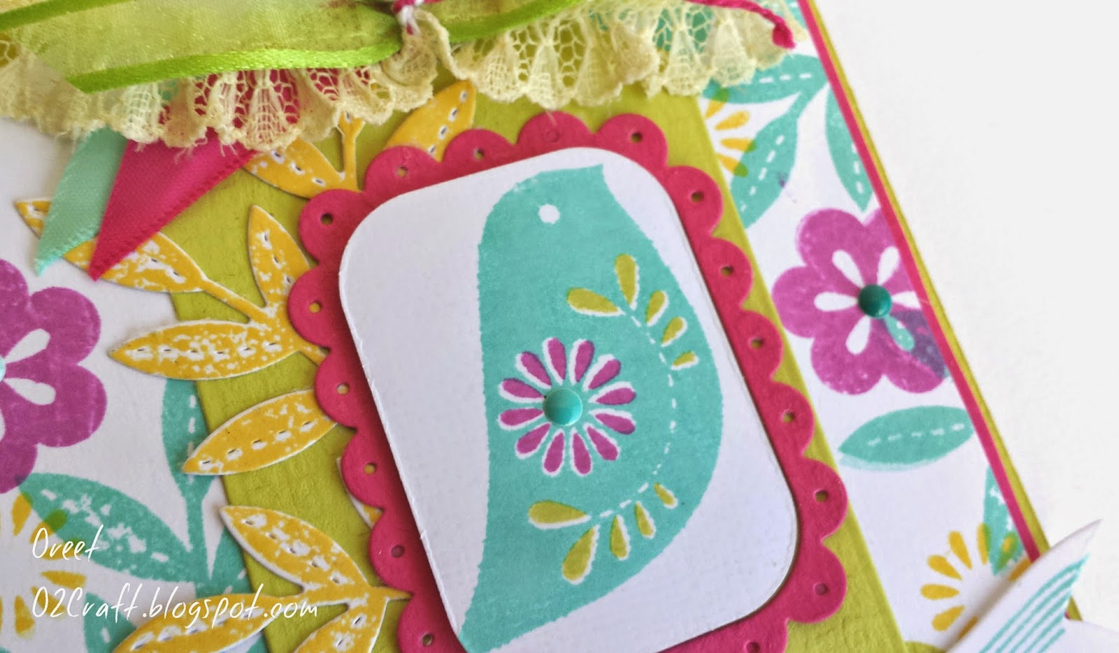
 I used several stamps on the border from the Songbird stamp set, florals, leaves and even a bird. For my focal point, I cut Tag Sale #4 in Raspberry Fizz, Simply Chartreuse and white and alternated the elements for depth. I then stamped the Songbird in Hawaiian Shores and accented the inner flower and leaves with Raspberry Fizz and Simply Chartreuse.  I then added at the bottom the Happy Birthday song line from the same set.
At the top, I made my first "junk bow"...I'm not quite sure if I'm crazy about it, I think the color need to be a bit more uniform and subtle for the bow to look right. Finished off the card with some teal enamel dots added to the centers of the flowers. Overall I'm not too fond of the card, I feel that it's a bit busy and think I'll go ahead and make another that is less so and quite a bit softer! How do you think it turned out?

Hope you're having a great week and happy holidays to all!
-O

Sunday, December 21, 2014

PTI: Make It Monday-Camouflage Die Cuts

Just managed to squeeze this one in! I decided to take a bit of a detour on mine--rather than using springing, I actually used my gorgeous Gansai Tambi Japanese watercolor paints and watercolored the bottom half of the die cut. I loved the freestyle feel it gave to an otherwise clean and simple card. I I stamped in black the "happy" and added a few sequins. I then mounted the panel onto a card base that was layered with polka patterned paper from Simple Stories DIY Christmas Collection. That's all for today!
 Hope you enjoy! 

-O

Monday, November 10, 2014

Fusion Card Challenge

When I saw this gorgeous inspiration photo, I was inspired and knew I had to participate!! This is my take on the challenge over at the Fusion Card Challenge blog

I went a bit shabby chic with this card. This is a tall card, perfect for wedding celebrations. Tattoo patterned paper pieces adhered to a Rustic Cream card base (PTI) , a lovely strip of lace with satin aqua ribbon threaded through. Then for the focal point, I die cut that lovely frame from PTI's Gatsby Glamour set and inked the edges with aqua chalk ink. I cut out a banner from Bountiful Banners, also PTI, added the sentiment in Cocoa and also inked the edges. Added various patterned and aqua ombre colored flowers and some white seam binding to finish it off. 
Such fun creating this card...that inspiration photo is so gorgeous I may not stop at one card. But for now, have a wonderful week and craft on!
-O

Thursday, November 6, 2014

All That Glitters is Gold

Metallics have made a comeback into the crafting world, which makes me a happy camper add I love the elegance gold and silver can add to a project. Virginia's View Challenge this month celebrates this return
I am all too eager to play along, such lovely inspiration too!

I started with a cream card base and layered mint, good polka dot paper on the bottom. Then a little lace strip to soften it follows by extremely glitzy gold, start filled glider tape. Good embossing on the sentiment, embossed vellum with gold and white add an ethereal elegance all finished of with some gold sequins.

Here is a close up:

Friday, June 27, 2014

Papertrey Ink's MIM #169: Vellum

Happy Friday and Shabbat Shalom!

I'm back with another card using *drum roll*...yep,vellum. Shocked I'm sure. My stepmother needed an engagement card, so I went into my craft room {which my sister describes as follows: "Wow, it looks like a pinata filled with confetti and sparkles burst in here...yep, that's about right, but I digress} and whipped this card up. I used the dies from Embellished Elegance and die cut vellum, white cardstock, shimmering text paper and started layering to create a wreath. I then slipped in some sequins in gold, silver and pearlescent white. Some peeking through the vellum layers, others accenting on top. Then I die cut some of the flowers from the set and heat embossed them in gold. This was all adhered to the beautiful and soft patterned paper from the Oh Darling collection (Crate Pa

per). Then to add texture and interested I adhered a large strip of lace to the bottom (as shown in this photo) and a thinner strip at the top. I then created the above double bow using sheer, gold metallic ribbon from The Ribbon Retreat.Finally adhered it all to my card base, rounded the corners to the right... et voila! Hope you enjoy and have a wonderful weekend!

As a special treat (I hope you view it as such :) here are a couple of photos of my son and his father at the pool whilst we were on vacation...man do I love Summer and those boys!


Craft on,
Oreet

Tuesday, June 24, 2014

Papertrey Ink's MIM #169: Vellum Overlays

When I saw this week's Make It Monday on Nichole Heady's blog, I let out a quick "Yaaaaay!!!" followed by a "Yippyyyyy!!". :) I have recently been on a "vellum kick" so I was excited to be able to play more with my new love that is this beautiful translucent paper. I just believe it adds such elegance and softness to a project like no other piece of paper can--truly magical! So here is one (surely to be one of many) project for this week's challenge... hope you enjoy it as much as I did in creating this card!


And until next time... Craft on!
-Oreet

Friday, February 7, 2014

7 items in 17 minutes!

Hello, I;m back with another submission for the PTI challenge of creating a card in 17 minutes using 7 supplies. It's also a Valentine's Day card, so it'll give a bit more inspiration for those of you who may be scrambling to finish them!

For this card, the supplies I used were:
1. Cardstock
2. Rhinestone
3. Ribbon
4. Twine
5. Stamp Set
6. Memento Love Letter Ink
7. Die

Hope you enjoy and craft on!
-O

Sunday, February 2, 2014

MIM #150

I had so much fun creating the card for PTI's Make It Monday Challenge, I decided to make another! Here it is:
The base was created using PTI's Rustic Cream Cardstock and from there I layered and stamped as Melissa Phillips did. The only slight variances that detracted from the original a bit is the use of vintage lace, lilac tulle and no button, twine or sequins. I wanted something soft and girly and I think I accomplished that, don't you?

Enjoy and craft on!
-O

Tuesday, January 28, 2014

Valentine's Day Series: Day 2

Hello all,

Today, as the subject states, is the 2nd day of the series celebrating love!
Below are a few more projects:


Apologies for a quick post-- I'm under the weather so I need to get some shut-eye but I wanted to make sure to post for the series!

Enjoy and craft on!
-O

Monday, January 27, 2014

Valentine's Day Series

As Valentine's Day is fast approaching, I thought I would post a card for the lovers' holiday daily! So here is Day 1:


Lots of layering and stamping in this card! Started with a cream heavy cardstock base, topped with patterned paper from Crate Paper and then overlayed a pink vellum sheet that is held in place with heart brads. I then topped that with Spellbinders' Decorative Labels 22, cut out from paper from My Mind's Eye and then basic Labels 22. The center piece was created using PTI's 2nd to last Polka Dot parade stamp set, which I think is just utterly charming! So there you have it, I'll check back in with another post tomorrow!

Craft on!

-O

Thursday, January 23, 2014

So recently I've been on a shabby chic style kick inspired by Mellisa Phillips-- I just love how romantic and soft her cards are and wanted to step outside my comfort zone. Also, as mentioned I've really been enjoying coloring with my Spectrum Noirs and Copic markers. Here are a few card projects:
This first one is shabby but still a bit cleaner, not too much fuss. Rustic Cream cardstock from PTI for the base, layered with patterned papers from Echo Park and then topped with Spellbinders' Labels 1 & Decorative Labels 8. The stamp set used is Ruby Reprise from PTI, such a charming and beautiful set! Embellished with some flowers, pearls and ruffled satin. I love the combination of cream and various shades of green.


 This anniversary card was quite a bit of fun to create-- It was actually inspired by the large flower. I took apart petals from a fabric flower and took a strip of Blush colored felt, created a 'lolly' flower and topped with various sized pearls. I knew I wanted to use it in a card project and when I came across my stash of Prima Almanac collection papers, I knewI was in business! The base is Cream from PaperAndMore.com (a wonderful source for cardstock!!) , topped with the Prima patterned papers, glued down Flora Lace from The Ribbon Retreat and then I once again used Spellbinders' Decorative Labels 8. I first cutout the largest size and then took the next to largest one and solely embossed it into the first cut. I then layed a tag from Spellbinders' Decorative Tags and topped it off with another die cut from Decorative Labels 8. Finally stamped the sentiment in Memento ink, added pearls et voila!


This card is most likely either appropriate for a baby card or for the special little girl in your life! The stamp is from a set I purchased from Michaels, though I cannot recall the name. I then went ahead and colored it in using my Spectrum Noirs. I backed it with Decorative Labels 1 and a larger sized mat of Labels 1. I slightly distressed the edges with Brushed Corduroy Distress Ink . Then to add a bit more interest, I tucked another Decorative tag at the back. The base is a cream cardstock bu layered with 3 different patterned papers all from the Easter 2013 Doodlebug collection. Between each layer, I applied ribbon-- the bottom is ruffled organza, in the middle a ruffled sation and finally at the top crochet lace. Topped it all off with some blush colored pearls and it was done! 

Hope you enjoyed these cards and I will be back with more soon!

Craft on!
-O


Monday, January 20, 2014

Bookmarks...

I recently received a new stamp set "All Booked Up" from PaperTrey Ink and just absolutely love it! I'm an avid reader and jumped at the opportunity to make adorable bookmarks that could be distributed as gifts to all! Here are a few:


 For this first one, I was going with a Shabby Chic look and what I love is that it allowed me to use a bunch of scraps-- I had a cream card base and then pieced together various scraps I had left over from other projects, added some distressing to each corner, lace between the different patters to break it up a bit and add interest, a sentiment on a Spellbinders label et voila!
 
Close up 


Here is another shabby chic bookmark-- similar color scheme and design but different colors and patterned paper. I just love the rustic look using distress inks with a stamp gives!
This one I wanted a cleaner and simpler look, though there still is quite a bit of "oomph". I used the brand new, lovely and FREE stamp set from Papertrey Ink called Ruby Reprise. Just a beautiful stamp set that allows for spectacular shadowing and dimension by layering the flowers. 
This bookmark is similar to the previous in that it is not quite as 'frilly' as the more vintage looking ones but still has plenty of interest. I used a stamp set from Penny Black for the florals and then colored them in with my Spectrum Noirs. I just really started getting in to coloring with alcohol markers so you will be seeing quite a bit of it from here on out

This final bookmark resembles the first two a bit more as it does have some of the same elements-- differing patterned papers, distressing, lace etc though the focal is this beautiful stamp from PTI that I of course colored in with my Spectrum Noirs again. As you are sure to notice, I absolutely love any color remotely close to aqua/teal so I implement it quite a bit into all of my artwork and cards!

Hope you enjoyed these and that it inspires you to make some of your own!


Craft on!

-O