 Have a fantastic week!
Monday, December 29, 2014
MIM À La Carte: Camouflaged Die Cuts
Thought I would give Laura's technique another go! I used the Shine die from the sparkle and shine collection and the patterned paper is from the Skakers and Sprinkles kit. Such a fun technique!
Have a fantastic week!
Have a fantastic week!Sunday, December 28, 2014
MIM: Stamped Borders
Slipping in a final entry, this time using the Hands of Time stamp set and made a fun shaker!

Saturday, December 27, 2014
MIM :Stamped Borders 2
I simply was not pleased with my last card...there were elements I liked, but I felt that it was far too busy, I didn't like my junk bow. I guess I was just lacking some mojo. Here is another attempt that I like quite a bit better. What do you think?
 I opted to make a Hanukkah card that I could send to my Mom. She's been in the hospital (in and out this past year) and I wanted something that would cheer her up and bring some light into her life. I know the challenge was to try for a sympathy card but a couple years ago I made a personal decision to not "stock" these in my card stash. It's not a superstition, I don't think that if I make them, I will lose dear ones but I suppose if the need comes, I like to do it on the spot as therapy. So,I used the stamp border technique and hope that "bringing cheer to a loved one having a rough time" might still meet the challenge!
 A close up of the gorgeous Star of David and "light burst" around it .
 and the inside of the card.
I opted to make a Hanukkah card that I could send to my Mom. She's been in the hospital (in and out this past year) and I wanted something that would cheer her up and bring some light into her life. I know the challenge was to try for a sympathy card but a couple years ago I made a personal decision to not "stock" these in my card stash. It's not a superstition, I don't think that if I make them, I will lose dear ones but I suppose if the need comes, I like to do it on the spot as therapy. So,I used the stamp border technique and hope that "bringing cheer to a loved one having a rough time" might still meet the challenge!
So I went with a slightly non-traditional Aqua Mist and Hawaiian Shores combination with traditional silver and bling! :) when the Festival of Lights stamp set was released a couple months ago, I knew I just had to have it!! Coupled with the previously released Mazal Tov set ....oh the possibilities!! And how can anyone NOT love the sentiment? Impossible!!
A close up of the gorgeous Star of David and "light burst" around it . and the inside of the card.
Craft on!
-O
Tuesday, December 23, 2014
PTI Make It Monday: Stamped Borders
Hello all,
This week's challenge was provided by the über talented Melissa Phillips and the technique of the week is to stamp a card border with various colors. Here is my first attempt:
 I used several stamps on the border from the Songbird stamp set, florals, leaves and even a bird. For my focal point, I cut Tag Sale #4 in Raspberry Fizz, Simply Chartreuse and white and alternated the elements for depth. I then stamped the Songbird in Hawaiian Shores and accented the inner flower and leaves with Raspberry Fizz and Simply Chartreuse. I then added at the bottom the Happy Birthday song line from the same set.
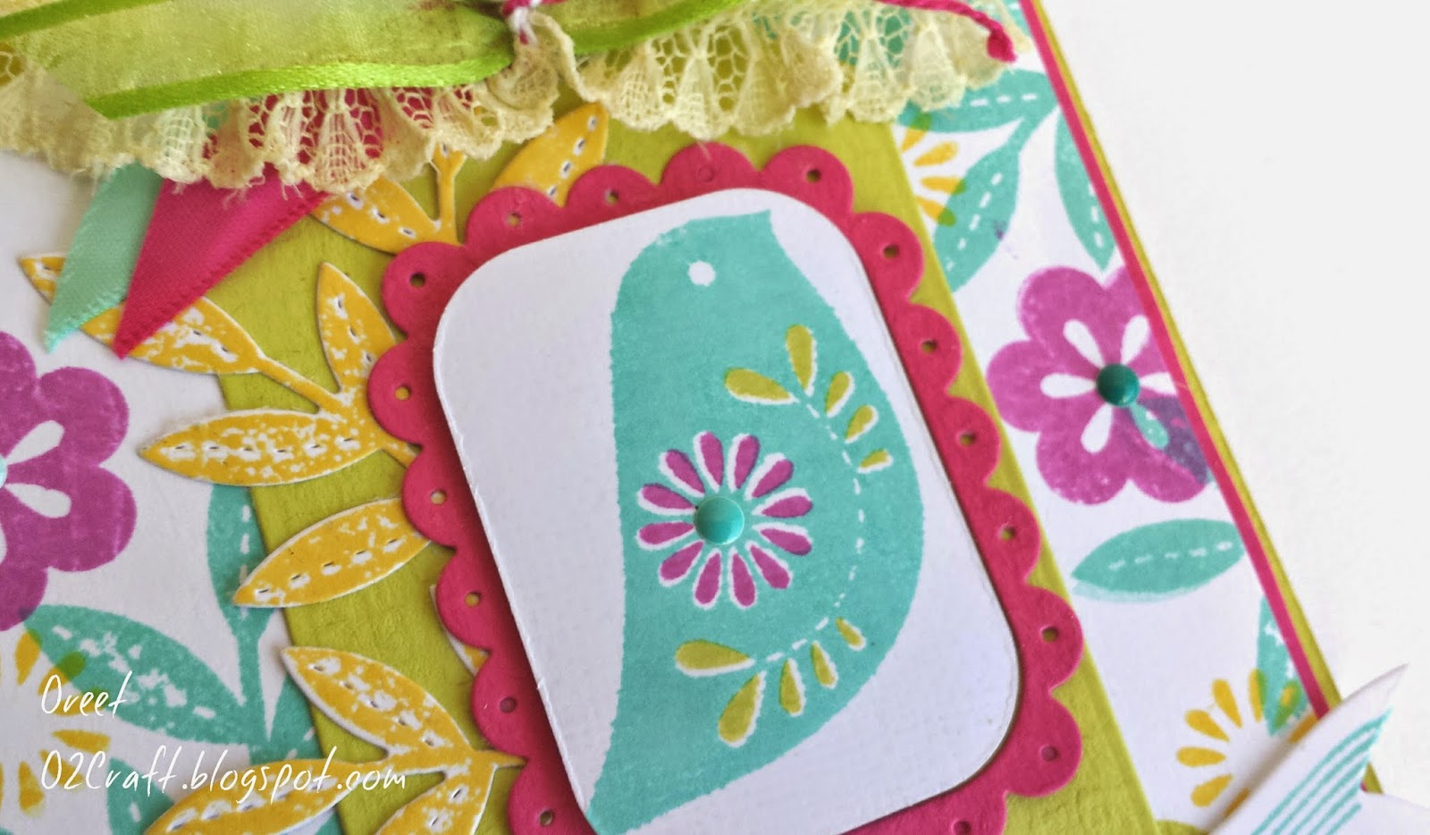 At the top, I made my first "junk bow"...I'm not quite sure if I'm crazy about it, I think the color need to be a bit more uniform and subtle for the bow to look right. Finished off the card with some teal enamel dots added to the centers of the flowers. Overall I'm not too fond of the card, I feel that it's a bit busy and think I'll go ahead and make another that is less so and quite a bit softer! How do you think it turned out?
This week's challenge was provided by the über talented Melissa Phillips and the technique of the week is to stamp a card border with various colors. Here is my first attempt:
I used several stamps on the border from the Songbird stamp set, florals, leaves and even a bird. For my focal point, I cut Tag Sale #4 in Raspberry Fizz, Simply Chartreuse and white and alternated the elements for depth. I then stamped the Songbird in Hawaiian Shores and accented the inner flower and leaves with Raspberry Fizz and Simply Chartreuse. I then added at the bottom the Happy Birthday song line from the same set.
Hope you're having a great week and happy holidays to all!
-O
Sunday, December 21, 2014
PTI: Make It Monday-Camouflage Die Cuts
Just managed to squeeze this one in! I decided to take a bit of a detour on mine--rather than using springing, I actually used my gorgeous Gansai Tambi Japanese watercolor paints and watercolored the bottom half of the die cut. I loved the freestyle feel it gave to an otherwise clean and simple card. I I stamped in black the "happy" and added a few sequins. I then mounted the panel onto a card base that was layered with polka patterned paper from Simple Stories DIY Christmas Collection. That's all for today!
 Hope you enjoy!
Hope you enjoy!
-O
Monday, November 10, 2014
Fusion Card Challenge
When I saw this gorgeous inspiration photo, I was inspired and knew I had to participate!! This is my take on the challenge over at the Fusion Card Challenge blog

 I went a bit shabby chic with this card. This is a tall card, perfect for wedding celebrations. Tattoo patterned paper pieces adhered to a Rustic Cream card base (PTI) , a lovely strip of lace with satin aqua ribbon threaded through. Then for the focal point, I die cut that lovely frame from PTI's Gatsby Glamour set and inked the edges with aqua chalk ink. I cut out a banner from Bountiful Banners, also PTI, added the sentiment in Cocoa and also inked the edges. Added various patterned and aqua ombre colored flowers and some white seam binding to finish it off.
I went a bit shabby chic with this card. This is a tall card, perfect for wedding celebrations. Tattoo patterned paper pieces adhered to a Rustic Cream card base (PTI) , a lovely strip of lace with satin aqua ribbon threaded through. Then for the focal point, I die cut that lovely frame from PTI's Gatsby Glamour set and inked the edges with aqua chalk ink. I cut out a banner from Bountiful Banners, also PTI, added the sentiment in Cocoa and also inked the edges. Added various patterned and aqua ombre colored flowers and some white seam binding to finish it off.
Such fun creating this card...that inspiration photo is so gorgeous I may not stop at one card. But for now, have a wonderful week and craft on!
-O
Thursday, November 6, 2014
All That Glitters is Gold
Metallics have made a comeback into the crafting world, which makes me a happy camper add I love the elegance gold and silver can add to a project. Virginia's View Challenge this month celebrates this return
 I am all too eager to play along, such lovely inspiration too!
 I started with a cream card base and layered mint, good polka dot paper on the bottom. Then a little lace strip to soften it follows by extremely glitzy gold, start filled glider tape. Good embossing on the sentiment, embossed vellum with gold and white add an ethereal elegance all finished of with some gold sequins.

I am all too eager to play along, such lovely inspiration too!I started with a cream card base and layered mint, good polka dot paper on the bottom. Then a little lace strip to soften it follows by extremely glitzy gold, start filled glider tape. Good embossing on the sentiment, embossed vellum with gold and white add an ethereal elegance all finished of with some gold sequins.
Here is a close up:
Wednesday, November 5, 2014
Curtain Call: Boho Bright

 Enjoy your week and as always...craft on!
-O
Tuesday, October 7, 2014
Runway Inspired Challenge
Excited to join in on the fun this week with the Runway Inspired Challenge. When I saw the inspiration photo, I was hooked!
For my card, I was mostly inspired by the colors and stars in the background. I went a bit unconventional because I actually created a masculine card...based off of women's fashion no less! Hope you enjoy!
 Here is the inspiration photo.

Here is the inspiration photo.Hello, lovely.
All you need to do is spend just a little bit of time looking through my blog posts and you will quickly find that CAS (clean and simple) cards are not my style and certainly not a strength of mine. So, that is precisely why I decided to participate in Virginia's View Challenge this month..it's just that, a tremendous challenge!! So here is my attempt at a clean and simple card. I started with a crisp white card base and cut a 5 1/2 x 4 1/4 pierce of patterned paper from Simple Stories' A Charmed Life collection. Then I cut it at a slant and adhered the bottom portion of the cut piece to the base. I cut a strip of polka dot navy blue gingham ribbon and adhered it with Scor-Tape. Stamped PTI's Wet Paint "Hello" in Butter Bar shadow ink from Hero Arts and "lovely" in navy.I then finished off the card with 3 baby bling rhinestones. Hopefully one of these days I'll be more comfortable with this style! That's all for today. Hope you enjoy and are not mortified by my poor attempt at CAS!!

Tuesday, September 23, 2014
Delight in this Day
The Make-It-Market Beautiful Brushstrokes kit from Papertrey Ink has been such a pleasure to play with-- such gorgeous supplies and the blooms and type for the sentiments are downright gorgeous! This card was inspired by the following sketch at The Pink Elephant Challenge this week: While at first it may not be apparent, you shall see that there are differing patterned paper at the exact places, the focal point (bouquet) and embellishment (twine bow) have the same placement as the sketch.
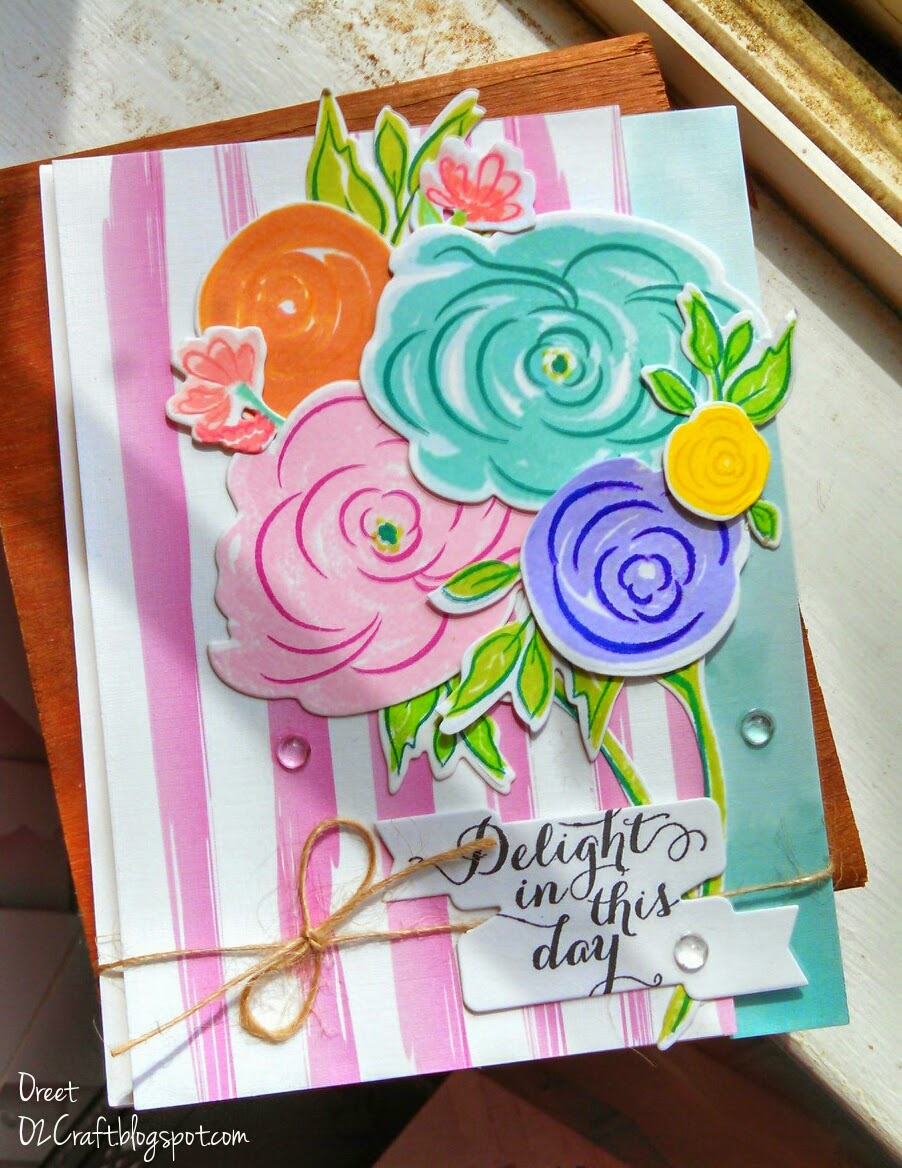

Oh and I just can't get enough of those rain stones from PTI! For more Pink Elephant inspiration, you can check the site out here.
Saturday, September 20, 2014
A Party without a Cake
I'm back with another card for yet another challenge...yes, I'm addicted! The colors for the card were inspired by the challenge colors at Colour Me Card Challenge.

Here is a fun card perfect for a young girl or a woman young and playful at heart!


Wednesday, September 17, 2014
Merry Monday #126
Well hello,
I'm back today with my first entry into the Merry Monday challenge I've never played along so hopefully you'll leave me some love and encouragement. ;) Here is the inspiration photo:

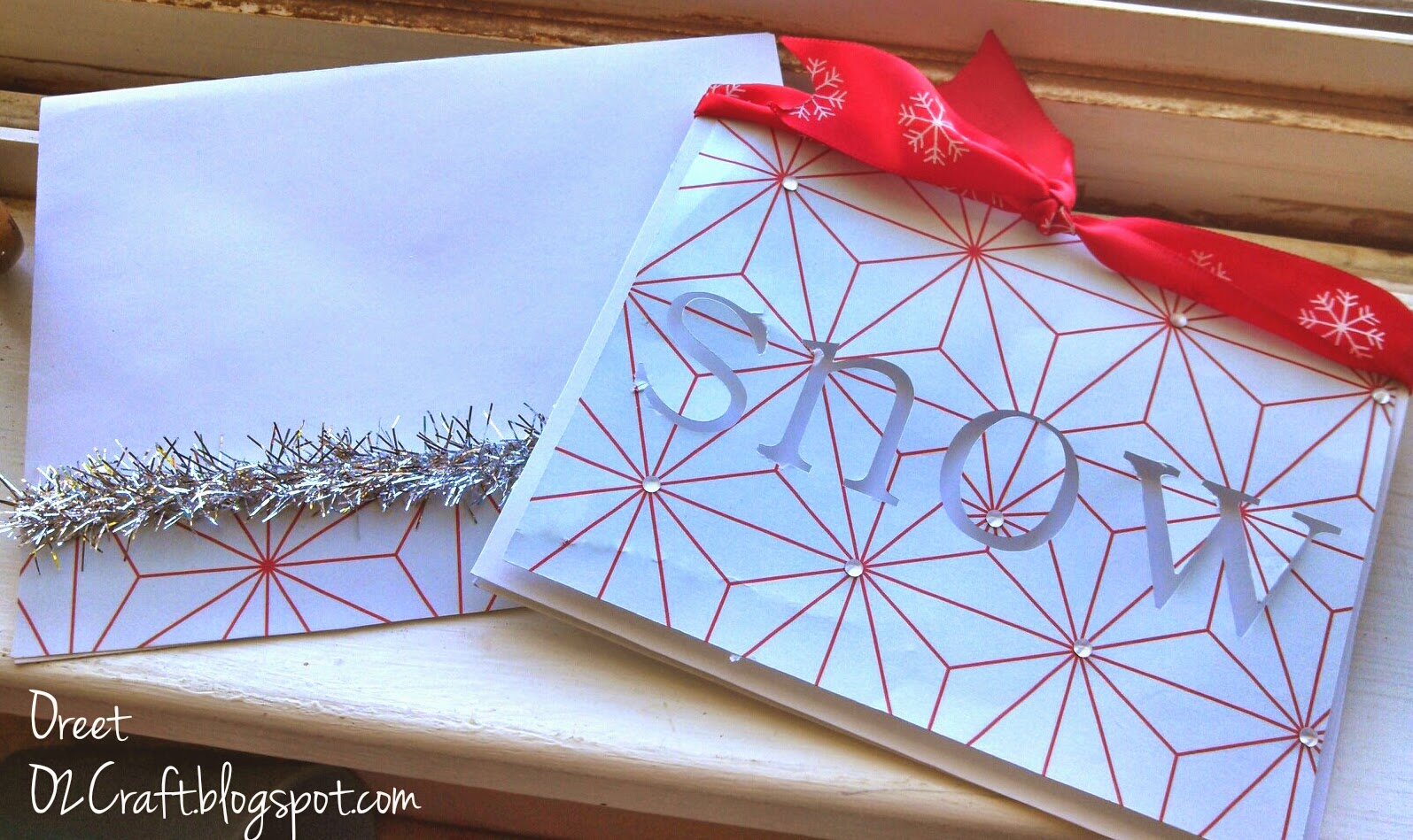
The challenge this week was to have the sentiment front and center, so I took it to heart and created this card.
 I actually went for a very simple design and allowed the cut, paper and ribbon do most of the work. I have absolutely no idea where the patterned paper is from, it was just in my stash and seemed perfect for the challenge. I cut the panel with my Silhouette cameo and popped it up with dimensional adhesive for added interest. Then , I grabbed some red accented with white snowflakes satin ribbon I purchased from Target a couple winters ago and added some mini-rhinestones. To complete the set, I adhered some of the same patterned paper and some garland like ribbon to an envelope...and there you go! So, what do you think?
I'm back today with my first entry into the Merry Monday challenge I've never played along so hopefully you'll leave me some love and encouragement. ;) Here is the inspiration photo:
The challenge this week was to have the sentiment front and center, so I took it to heart and created this card.
I actually went for a very simple design and allowed the cut, paper and ribbon do most of the work. I have absolutely no idea where the patterned paper is from, it was just in my stash and seemed perfect for the challenge. I cut the panel with my Silhouette cameo and popped it up with dimensional adhesive for added interest. Then , I grabbed some red accented with white snowflakes satin ribbon I purchased from Target a couple winters ago and added some mini-rhinestones. To complete the set, I adhered some of the same patterned paper and some garland like ribbon to an envelope...and there you go! So, what do you think?Monday, September 15, 2014
You're a Pro- Masculine Card
Another submission to the Color Throwdown Challenge #309 ...just love the color scheme and it's perfect for masculine cards too!!

 Also submitting to:

Sunday, September 14, 2014
For A Special Day
I wonder if like me you've ever had the tendency to pine for a stamp set, purchase it and then forget about it for a while until one day you stumble upon it again and can't figure out why you ever tossed it aside like an old dirty sock? And then use it over and over again as penance for having forsaken that beloved stamp set? Hahaha. Well that's precisely what happened with this Simon Says Stamp February release stamp set...Such a gem!
Seems only fitting that I would enter it into the following two Simon Says Stamp challenges, here and here.
I started with a white card base, standard A2 sized, and layered a hand stamped "wonky" panel using the largest floral stamp in the aforementioned Simon Says Stamp set. I cut the flower with my Silhouette Cameo out of textured red/black cardstock and then used a large tipped stylus to add texture and "veins". A small black brad was used in the center to connect the pieces together and to adhere the embellishment to the panel. For the sentiment I used this beautiful handwriting-styled stamp also included in the set. Some tiny rhinestones underneath it and at the center of the stamped flowers and poppy red seam binding finish off the card.Thanks for stopping by and as always...craft on!
-O
Enjoy the Good Life
The Pink Elephant Challenge
 What a lovely and bold inspiration photo, right?! So in my card, I wanted to mimic the differing patterns, the array of texture and sharp colors, while still giving off a rustic elegance.I find it odd that sometimes something as tiny as a little wooden clip can be the 'jumping off point' of an entire project. I saw that adorable clip on my craft room table, took another look at the inspiration photo and I was off... I thought it had the perfect pairing of organic, rustic elegance and whimsy that inspired me. So, I went to work at finding richly patterned papers that had the texture and color scheme of the inspiration photo and then coupled them with stamp sets (PTI Friendship Jar Fillers- Summer & Wet Paint) that I felt shared that same feel. The little pocket was easily created by following the quick and easy steps Melissa Phillips shared on her blog a few months ago here.


Close up of the button threaded through with natural twine and the itty-bitty floral confetti to tie in the blue background.
.
I colored in that adorable little bee with my Copics and added the non traditional color of aqua to the wings to tie in the color of the patterned paper.
Also submitting to: Fattastic Tuesday Challenge and Crafting Musketeers Challenge and Virginia's View Challenge and Addicted to Stamps Challenge


Hip-Hip Hooray...I'm cured!
 And another for The Cure for The Monday Blues challenge. I find that when I already have my supplies out for one project, it's super easy to make another card (or 2, or 3 ;) and it 'feeds' my need to not waste those precious scraps of patterned paper. I know, I'm a paper addict, guilty as charged. :) So my card was predominantly inspired by the lovely color scheme of the photo Can't get enough of mint, pink, berry, blush colors, what can I say?! Another thing I can't get enough of, as you will soon know if you just scroll through some of my other posts...vellum! Couldn't resist throwing in just a touch of that beautiful, ethereal paper with the blush rose embossed on vellum leaf accenting the Rosie Posie PTI stamped flower.
Thanks for stopping by and I'm now off to Paper-a-Holics anonymous meeting. ;)
Craft on,
-O
Also submitting to: Virginia's View Challenge #7
Saturday, September 13, 2014
Cupcake Diva
Hello, happy Saturday to all. Quick post today-- submitting a card inspired by the following
 I absolutely loved the color combination of mint, peach/pink and red, so lovely! And what's not to like about a dessert with a cherry on top?! ;)
 Supplies:
Paper- AC Crate Paper Oh Darling, Peach cardstock Michaels,
Stamps-
Ink/coloring-Memento Tuxedo Black, Spectrum Noir and Copics
Embellishments- Prima Something Blue flower embellishments, Want2Scrap Baby Bling silver
That's all for now. Have a wonderful week and craft on!
-O
Also submitting to: Virginia's View Challenge andAddicted to Stamps Challenge
Cure for the Monday Blues Challenge: Trifling #29
I absolutely loved the color combination of mint, peach/pink and red, so lovely! And what's not to like about a dessert with a cherry on top?! ;)Paper- AC Crate Paper Oh Darling, Peach cardstock Michaels,
Stamps-
Ink/coloring-Memento Tuxedo Black, Spectrum Noir and Copics
Embellishments- Prima Something Blue flower embellishments, Want2Scrap Baby Bling silver
That's all for now. Have a wonderful week and craft on!
-O
Also submitting to: Virginia's View Challenge andAddicted to Stamps Challenge
Friday, September 5, 2014
August Card Chain Challenge

A few days later than promised but here is my card for this month's challenge, hosted by Deborah at Society of Stampaholics
My stamped, floral focal point was created with the Papertrey Ink Bold Bouquet stamps and dies. I just love stamp sets such as these that are multi-step and really allow for depth of color and detail. I also love the sentiments included in the stamp set-- the type is very modern and just lovely coupled with the florals. I went with bright, "punches" of color using Hero Arts' neon color line and finished it all off with rhinestones and white seam binding. Such fun to create and hopefully the recipient will enjoy it as much as I did while creating it! I'll also be submitting this card into the Simon Says Stamp challenge, both the patterned paper and inks (Doll Pink, Hero Arts' shadow inks etc) were purchased at their huge, awesome selection stamping online "mall".
Also submitting to: Runway Inspired Challenge here and Virginia's View Challenge
Friday, August 29, 2014
July Card Chain Challenge
Yes, this is late...in fact VERY late, though thankfully not to the recipient, which is nearly unheard of for me. I'm usually a few days late, at best...but I digress! :) The challenge was to either use the color scheme or sketch, or both!


I thought it would be fun to combine both. So here is a picture of the card that I sent to Helen in Ohio:
 I mostly used Papertrey Ink stamp sets for this project. I must admit that I found this month's challenge to be anything but because I actually LOVE with a capital L-O-V-E aqua and teal and think the two colors combined with grey is simply dreamy. As for the sketch, I was not quite as literal and had fun clustering the elements and incorporating circles but going whimsical with the flowers instead. Such fun! And here is a close up of the inside of the card.
 Hope you enjoyed this card and I'll be back tomorrow for more with the August Card Chain Challenge reveal!
Friday, June 27, 2014
Papertrey Ink's MIM #169: Vellum
Happy Friday and Shabbat Shalom!
I'm back with another card using *drum roll*...yep,vellum. Shocked I'm sure. My stepmother needed an engagement card, so I went into my craft room {which my sister describes as follows: "Wow, it looks like a pinata filled with confetti and sparkles burst in here...yep, that's about right, but I digress} and whipped this card up. I used the dies from Embellished Elegance and die cut vellum, white cardstock, shimmering text paper and started layering to create a wreath. I then slipped in some sequins in gold, silver and pearlescent white. Some peeking through the vellum layers, others accenting on top. Then I die cut some of the flowers from the set and heat embossed them in gold. This was all adhered to the beautiful and soft patterned paper from the Oh Darling collection (Crate Pa

 per). Then to add texture and interested I adhered a large strip of lace to the bottom (as shown in this photo) and a thinner strip at the top. I then created the above double bow using sheer, gold metallic ribbon from The Ribbon Retreat.Finally adhered it all to my card base, rounded the corners to the right... et voila! Hope you enjoy and have a wonderful weekend!
As a special treat (I hope you view it as such :) here are a couple of photos of my son and his father at the pool whilst we were on vacation...man do I love Summer and those boys!


Craft on,
Oreet
I'm back with another card using *drum roll*...yep,vellum. Shocked I'm sure. My stepmother needed an engagement card, so I went into my craft room {which my sister describes as follows: "Wow, it looks like a pinata filled with confetti and sparkles burst in here...yep, that's about right, but I digress} and whipped this card up. I used the dies from Embellished Elegance and die cut vellum, white cardstock, shimmering text paper and started layering to create a wreath. I then slipped in some sequins in gold, silver and pearlescent white. Some peeking through the vellum layers, others accenting on top. Then I die cut some of the flowers from the set and heat embossed them in gold. This was all adhered to the beautiful and soft patterned paper from the Oh Darling collection (Crate Pa
As a special treat (I hope you view it as such :) here are a couple of photos of my son and his father at the pool whilst we were on vacation...man do I love Summer and those boys!
Craft on,
Oreet
Wednesday, June 25, 2014
And another...
Yes, this is a notebook...wanted to make one despite having missed Erin's MIM for this DIY beauty. While it is not a card project, the color scheme was absolutely inspired by the photo for the hop:


Subscribe to:
Posts (Atom)